Scribe2021-2025
Design Systems at Scale
As Scribe scaled from a single product surface to multiple teams shipping in parallel, inconsistent components and one-off styling were slowing down delivery and creating a fragmented product experience. There was no shared source of truth between design and engineering.
Scope & impact
I helped lead and govern the design system initiative, Stylus, from the ground up, partnering directly with other designers and engineering leads across several product teams and defining guidelines for usage.
Over 80% adoption across product teams after we established it.
Role
Lead Product Designer
Team
Design + engineering leads across product teams
Tools
Figma, Cursor
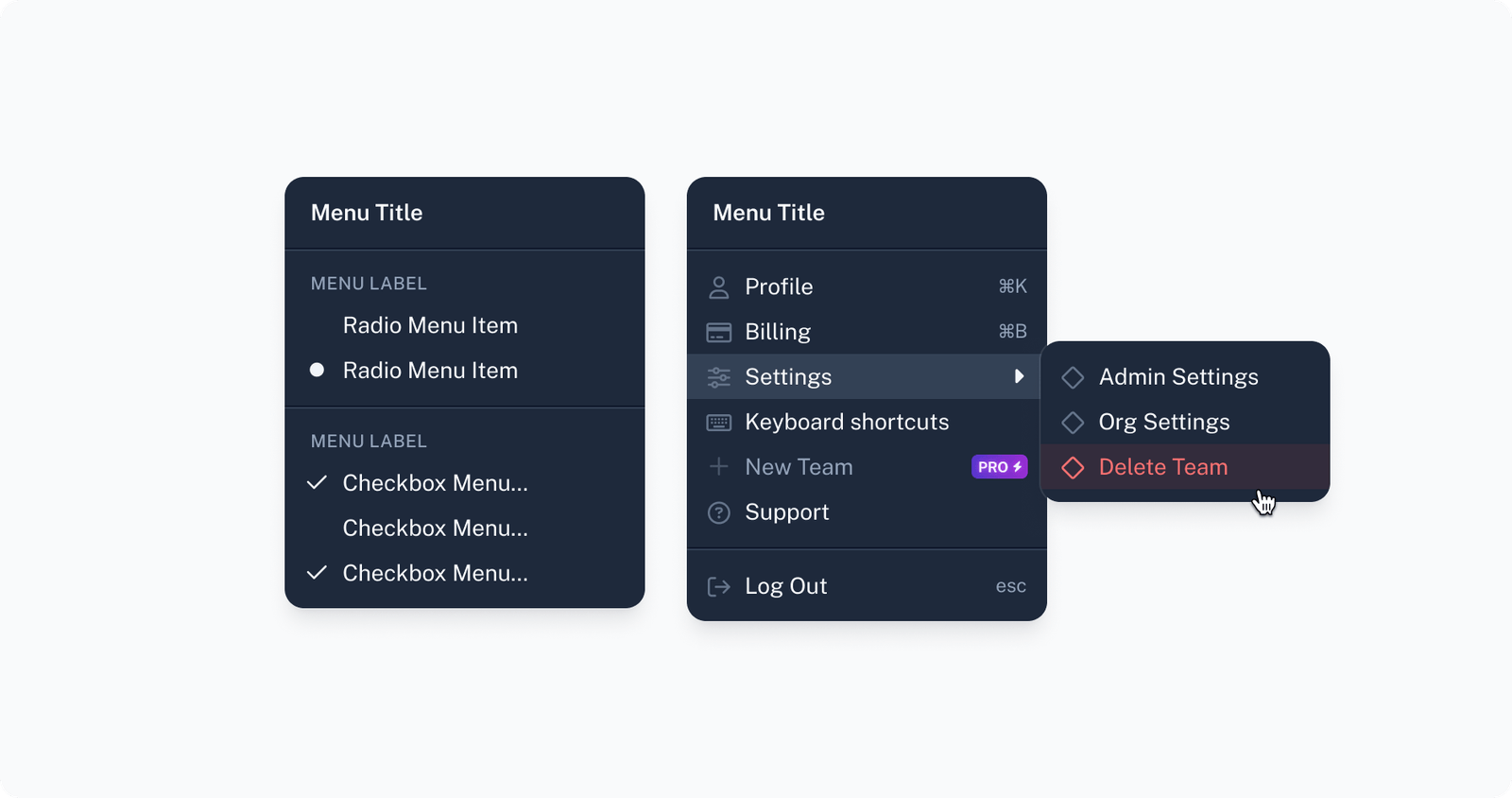
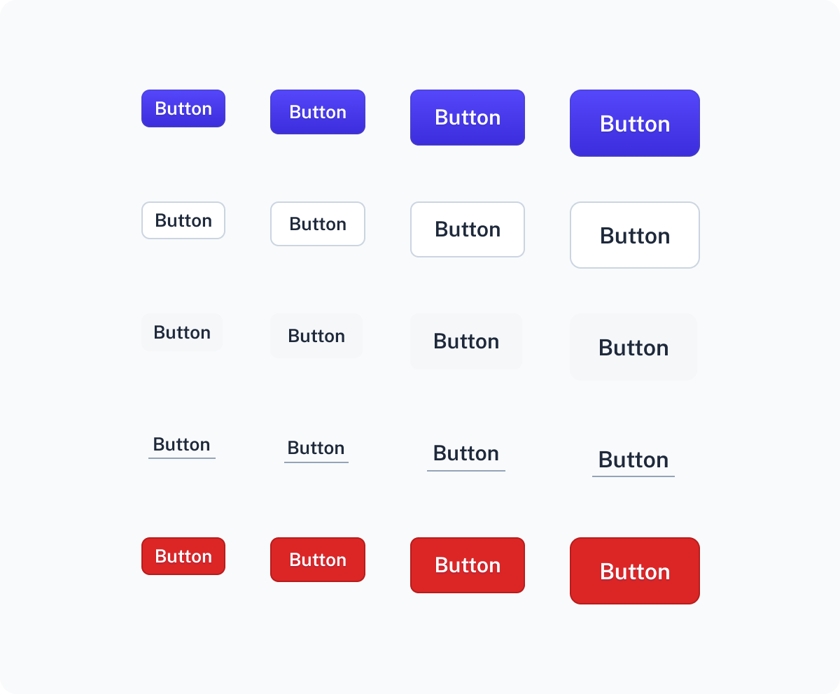
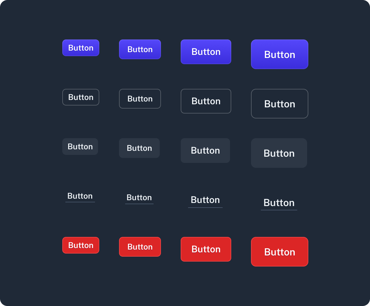
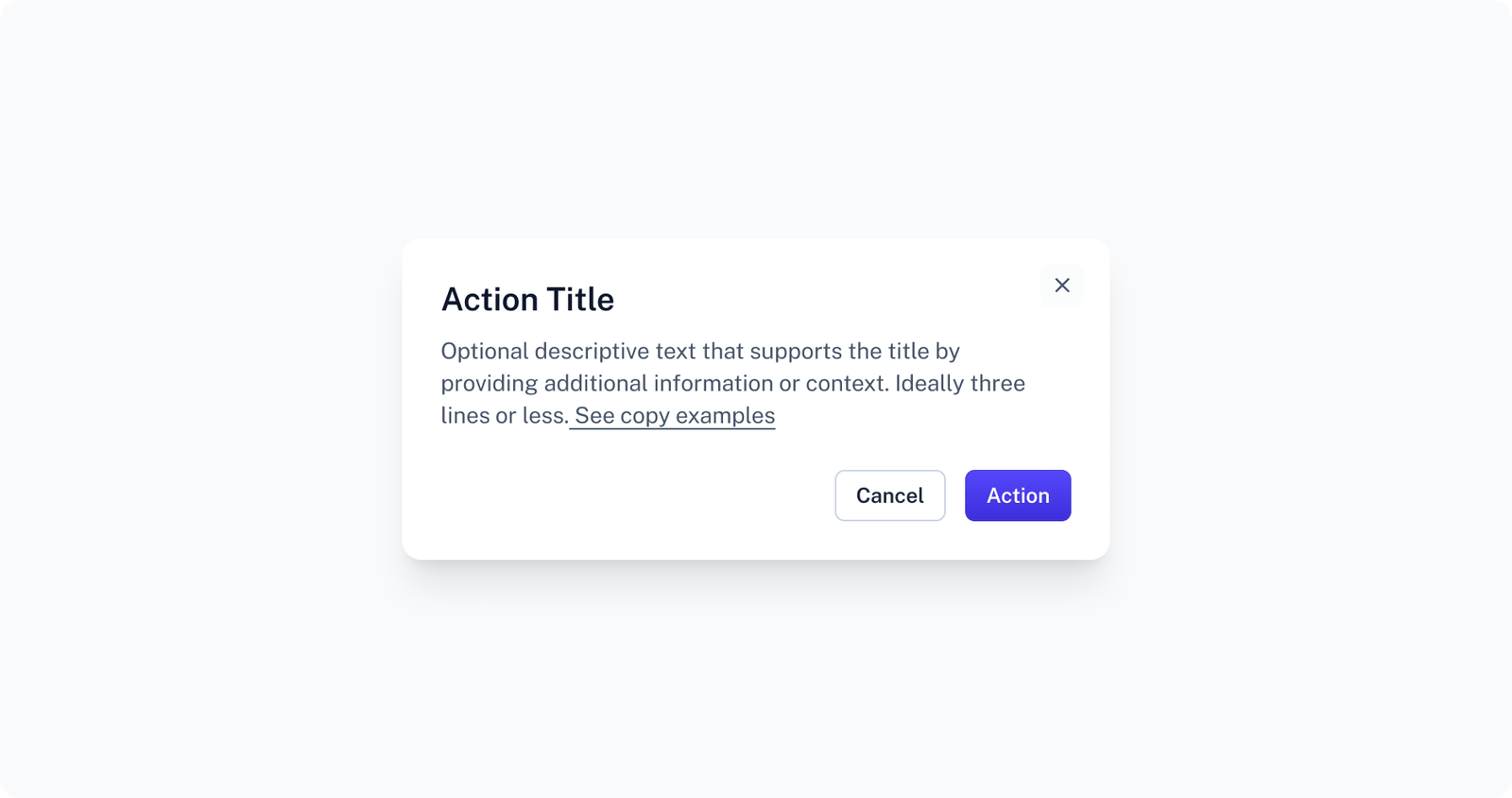
Component library
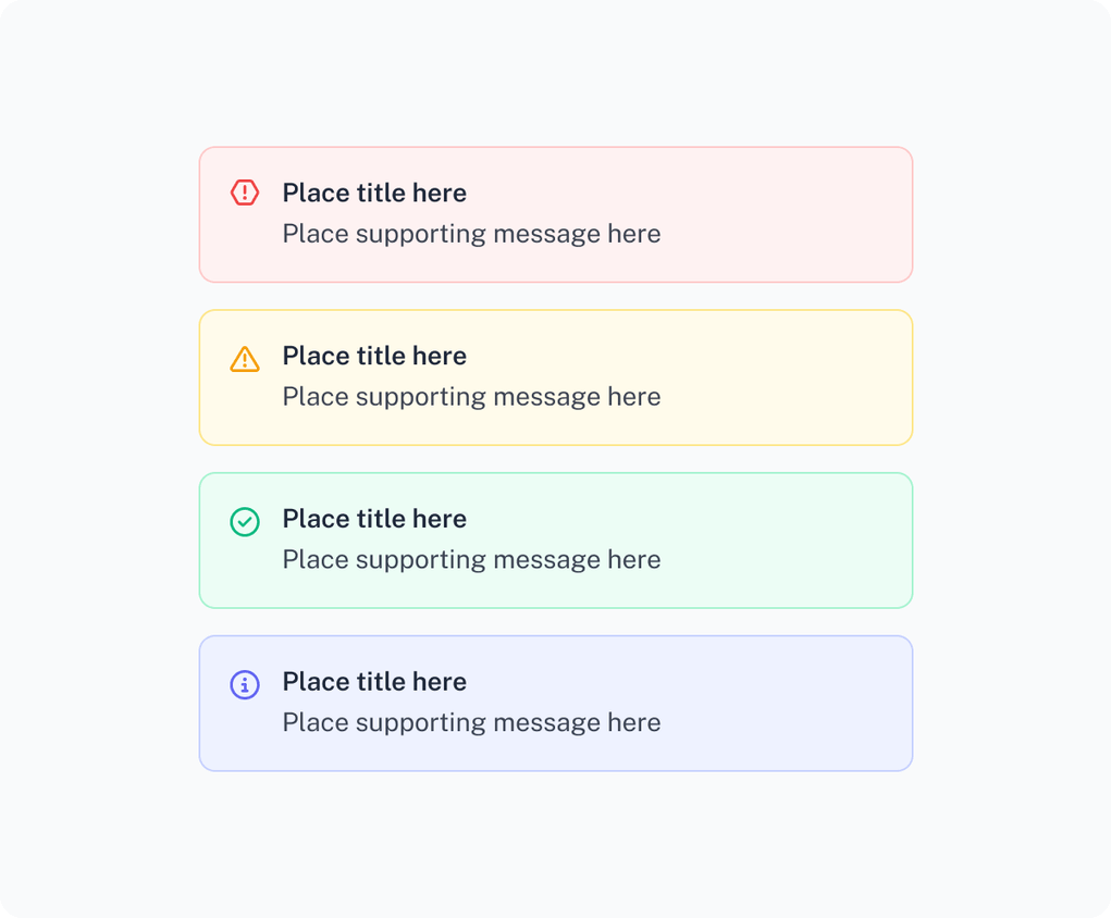
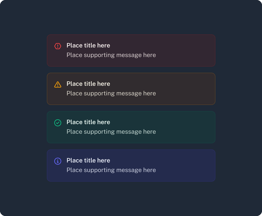
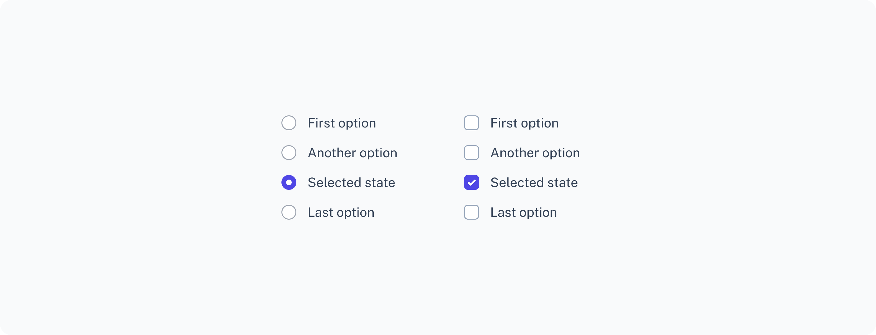
A shared library of reusable components — covering navigation, forms, feedback, and overlays — gave teams a consistent, accessible foundation to build from instead of reinventing patterns page by page.