Rally UXR2025
Redesign observation rooms to increase usage to a valuable feature
The Rally UXR observation rooms were an under-utilized feature that held real value for research teams. The user problem was there was no way to interact with observers during the interview or cleanly capture outtakes to share. The old version lacked visual hierarchy that made it harder for users to find the transcript and details.
Scope & impact
I started this project as part of a hack-a-thon in my second week at Rally UXR. I discovered the value after several conversations with teammates and auditing the product. I then validated the idea with support tickets and user feedback.
The impact of this initial discovery work was that it led to a full project on the product roadmap that another designer later picked up. That designer pulled directly from my layouts and was able to enhance some of the earlier ideas such as clips. The release of the new observation rooms was a big success and received a lot of positive feedback. (No numbers or quotes at this time)
Role
Lead Product Designer
Team
Solo project
Tools
Figma (no AI tools for this one)
Design decision: Split interface into functional sections
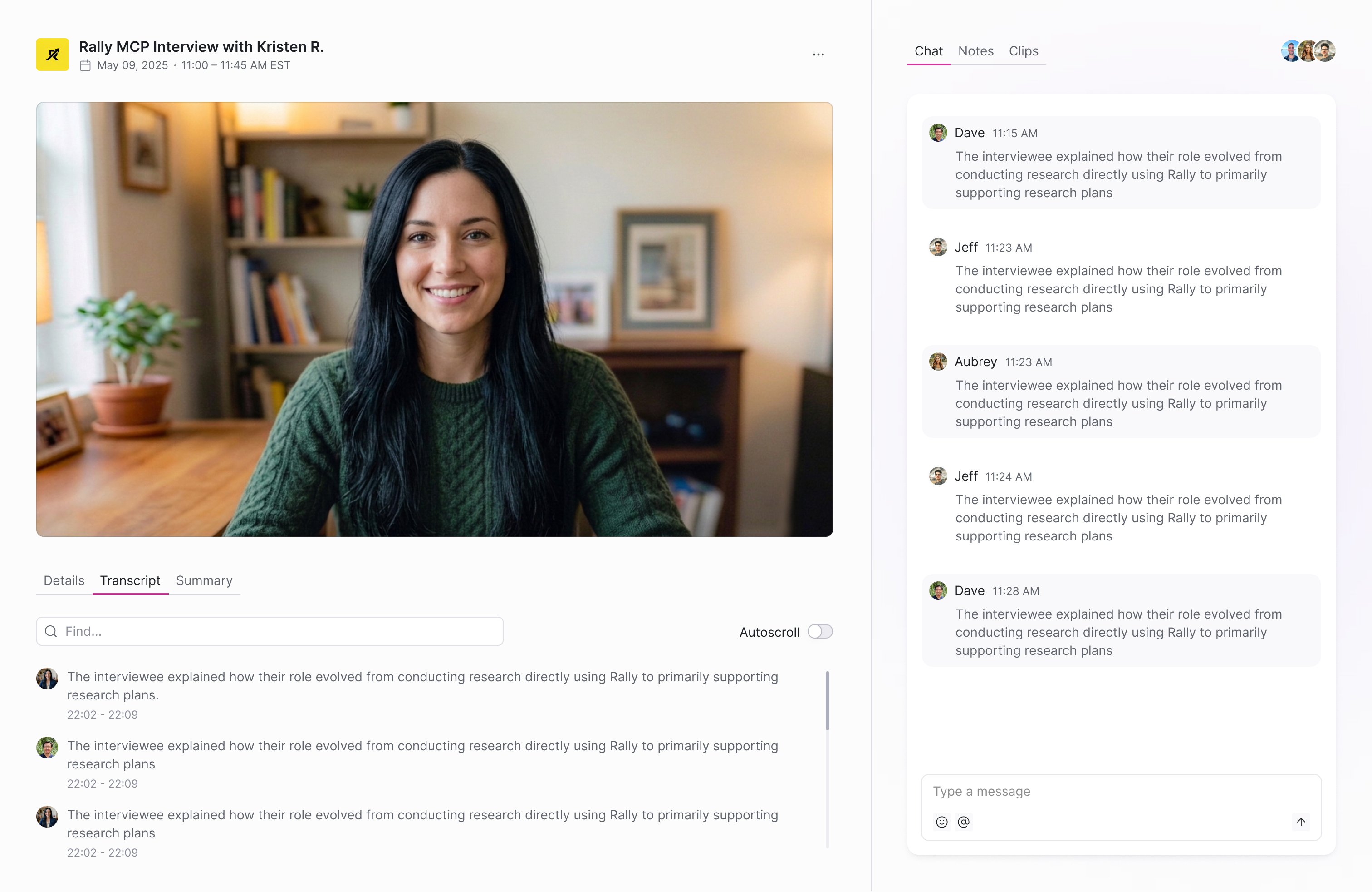
The first idea I had was to split the interface into two sections in order to give it better structure and visual hierarchy. The first section on the left is where all the main content would live (the title, video, details, transcript, and summary). The second section on the right would be where we add additional features like chat, notes, and clips.
Design decision: Explore new feature enhancements
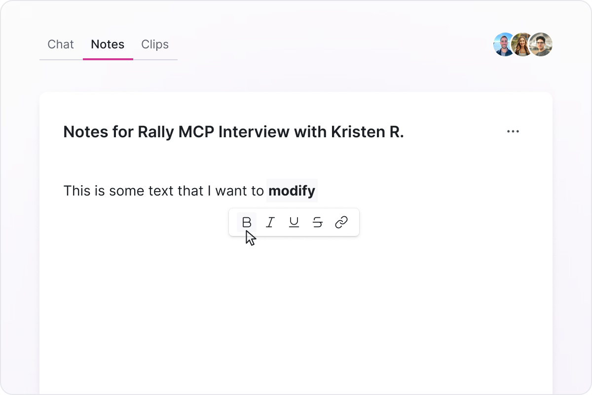
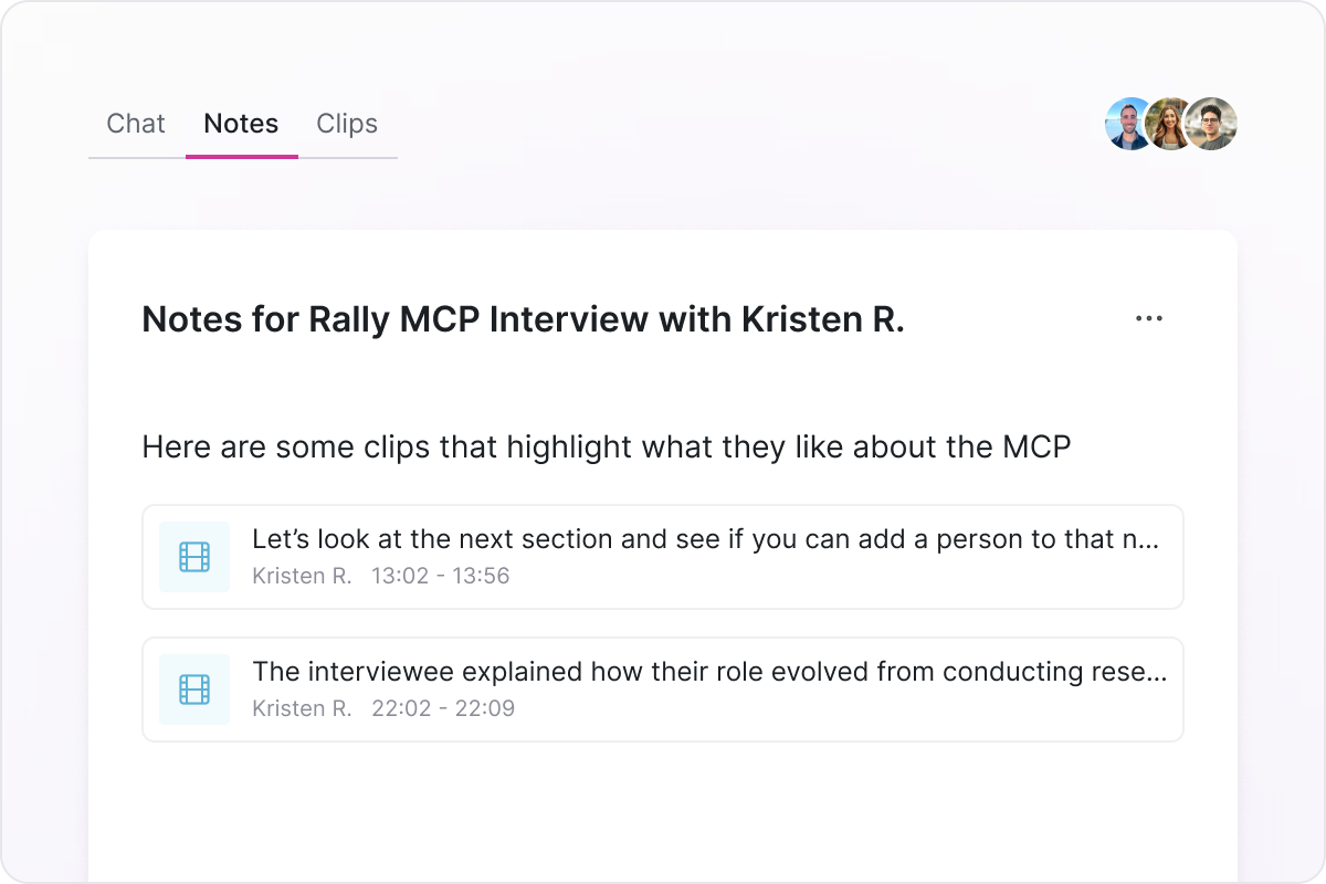
The additional features like chat, notes, and clips were aimed to increase engagement with the observation rooms for both active and completed interviews. Users could return to see past comments, notes, and saved clips that they could share as needed.