Scribe • Case Study
Scribe's flat navigation model that had worked at a smaller scale couldn't support the number of teams and roles the product now needed to handle. Users increasingly struggled to navigate the product and locate content. Switching between sections felt disorienting, and admins lacked clarity when managing multiple teams.
The old navigation system couldn't scale with product growth or support different user roles, which led to confusion, inefficiency, and unnecessary support tickets.
Lead Product Designer
2 Designers, 1 PM, & 2 Engineers
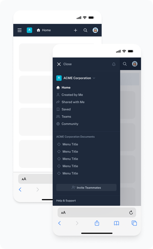
Create a clear, scalable navigation framework that worked across teams, roles, and devices
Decrease support tickets related to workspace and navigation confusion
I worked with the PM and engineering to dig into the underlying patterns from support tickets and usage data. The real issue was structural as the IA hadn't evolved alongside the product, and admins managing multiple teams had no consistent mental model to rely on.
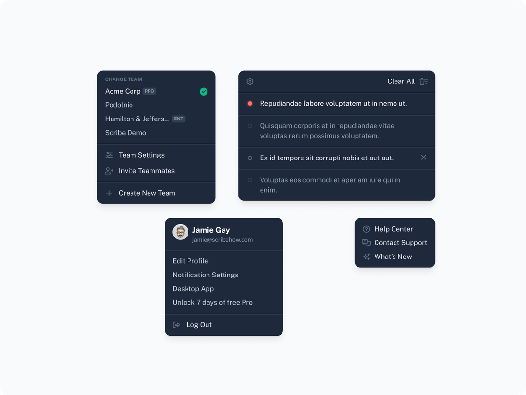
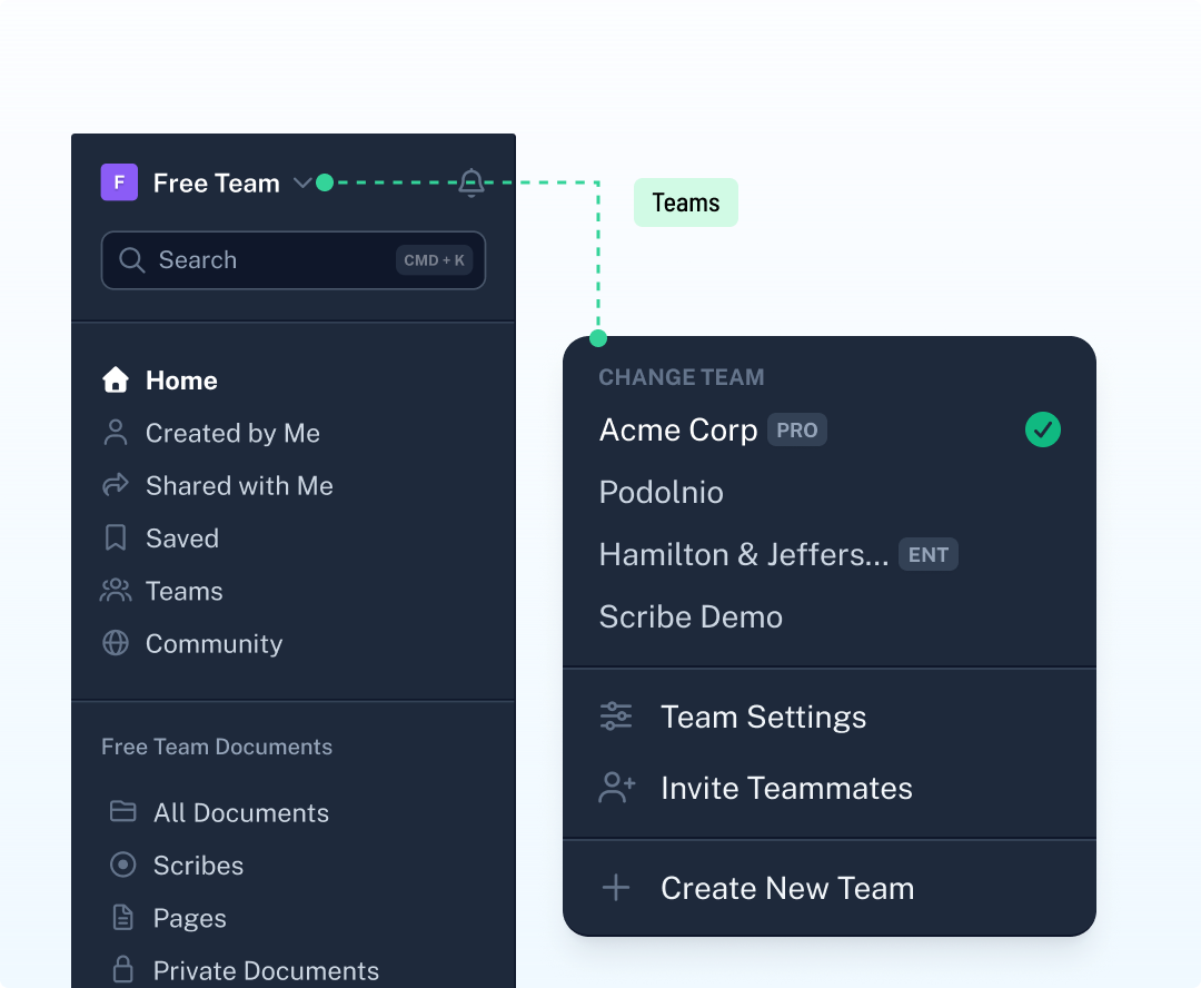
We (the two designers) then mapped workflows by role and team. Different user types moved through the product in fundamentally different ways, so any navigation system that worked for one role risked adding friction for another. That insight shaped the direction that the product needed a structural framework flexible enough to serve multiple roles without fragmenting into multiple experiences.
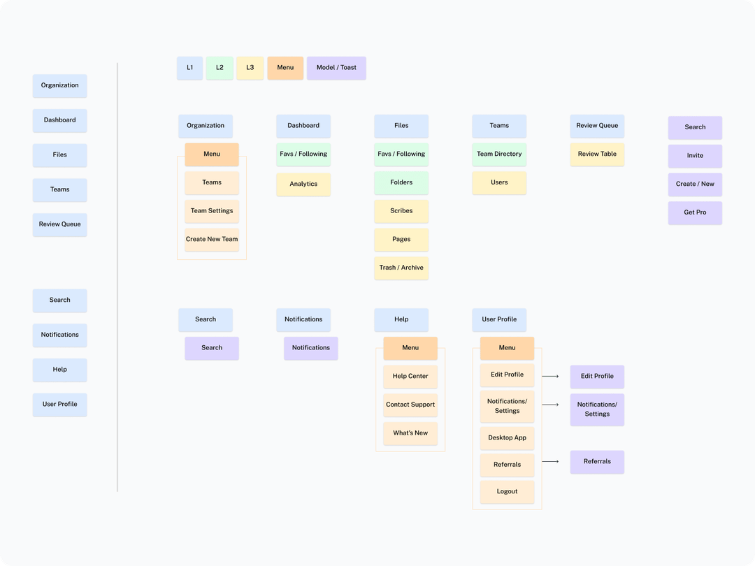
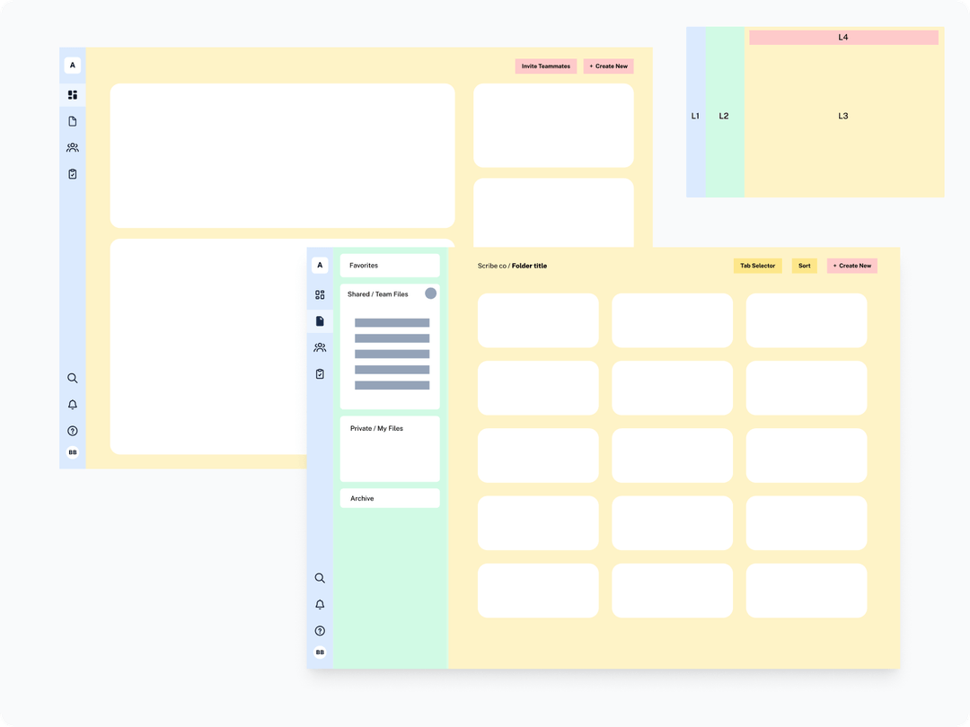
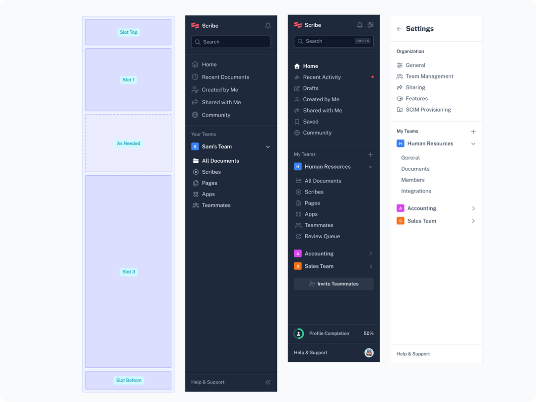
I led the rework of the IA into a structured L1–L4 hierarchy which was modeled to hold up under future growth, not just solve the immediate confusion. I treated this as the foundation the rest of the system.
I then prototyped and tested navigation models, using the results to challenge assumptions about what "clear" meant for different roles rather than just confirm a single direction. We started with a condensed navigation that only showed the icons. The thought was that would give more room for the main content areas.
Although users loved the updated designs and layout, the condensed view did not solve one of the core issues of clarity.
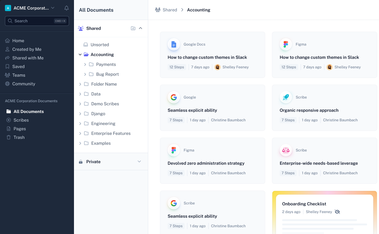
We were already working on an expanded view where the user could switch between the two, but with the feedback we decided to keep it as an expanded version.
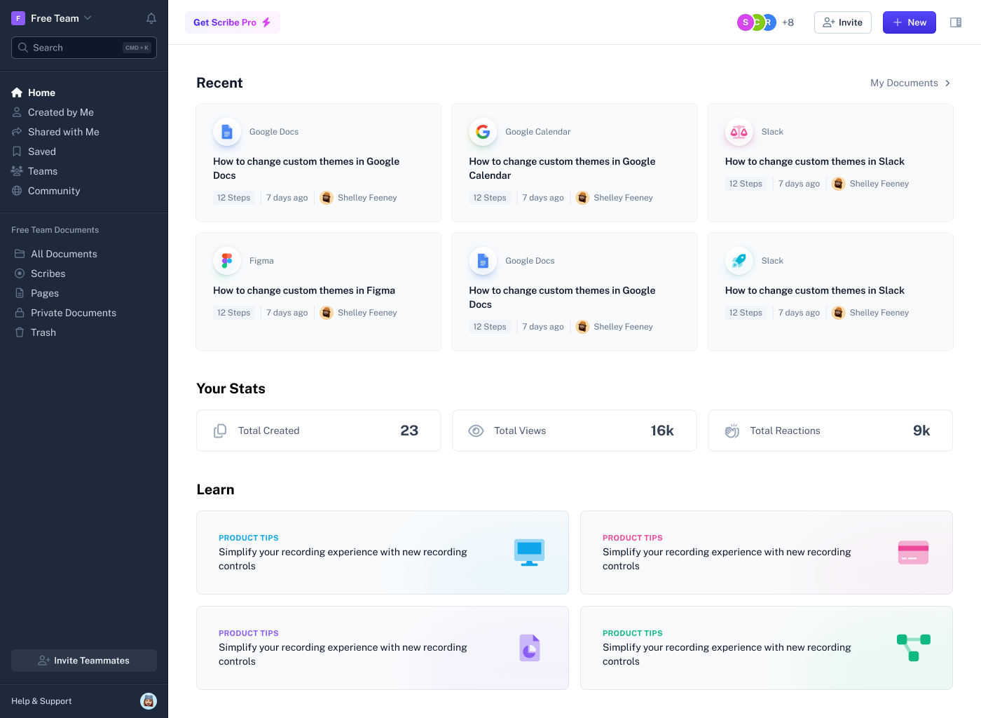
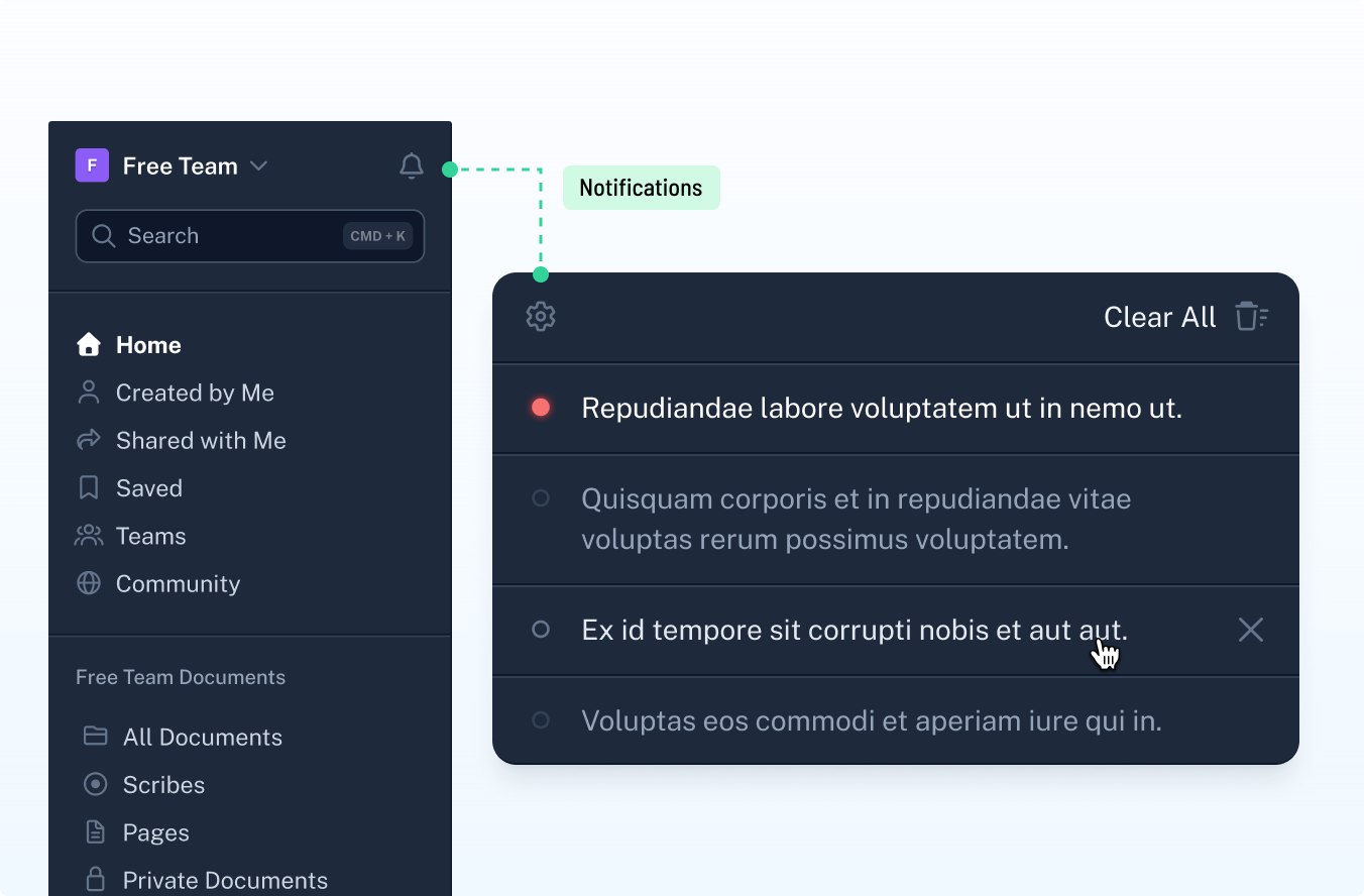
We ended up with a slotted approach that could scale with additional features, teams, and content. It worked for both the main product and the admin settings pages.
Navigation-related support tickets down 16%
Increased efficiency for admins managing multiple teams based on feedback through customer support and testing
Saved internal teams time with making decisions on organization, features, and bug fixes