Scribe2023
Unifying Enterprise Admin
& Team Settings
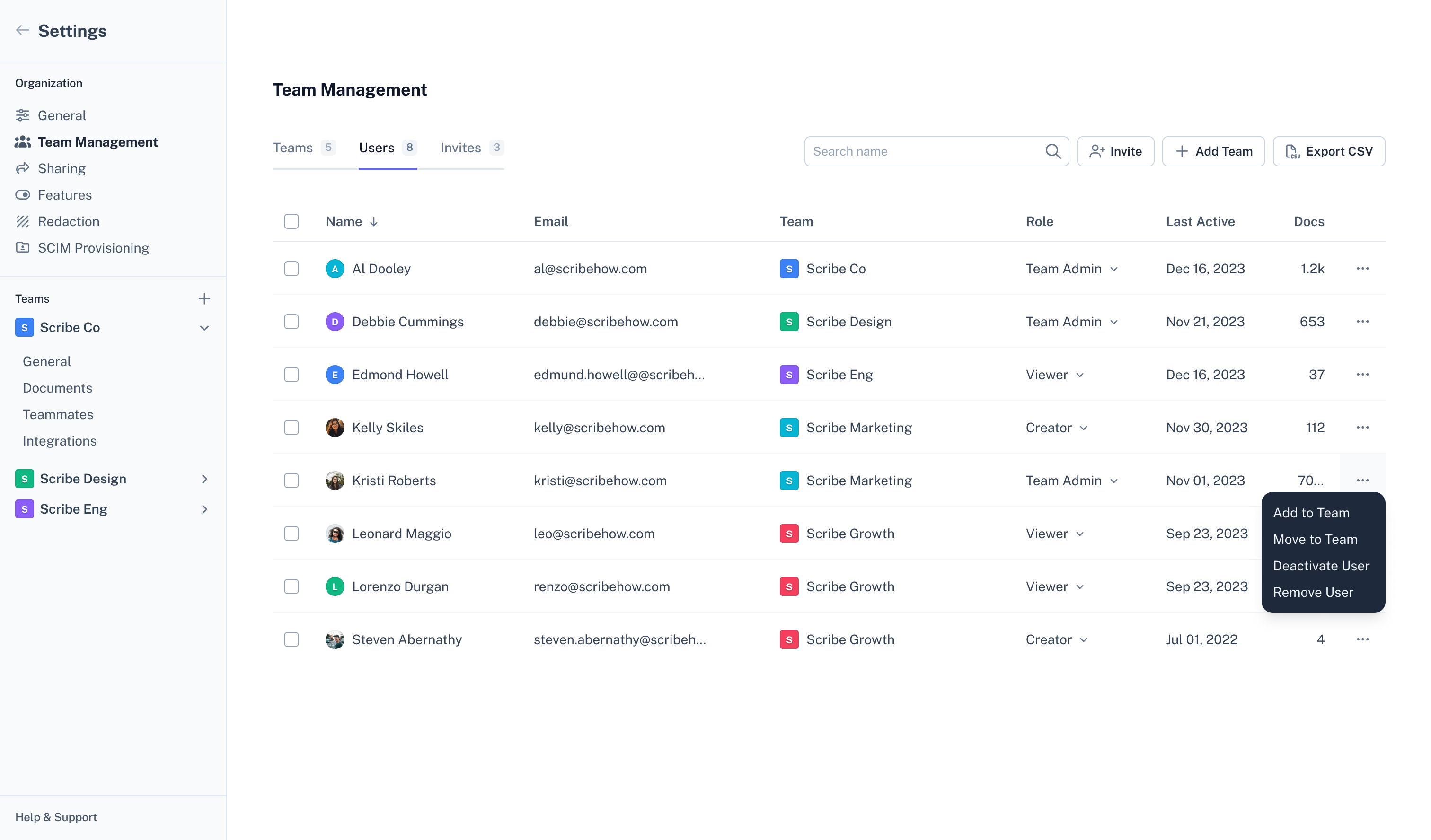
As Scribe scaled to multiple teams inside a single organization, the settings experience had not scaled with it. Team Settings and Enterprise Administration lived in separate places which caused confusion and errors with managing teams, permissions, and provisioning new users.
Scope & impact
This started as a self-initiated project that I was eventually able to get on the roadmap. Admin and settings work kept losing out to other priorities, so I made the case using customer support data and design audits.
Support tickets related to settings and permissions dropped by 24% within three months of launch.
Admin onboarding time decreased by 20%, enabling faster team setup and adoption.
Role
Lead Product Designer
Team
1 Designer, 2 PMs, 4 Engineers, Customer Support
Tools
Figma, Pre-AI
Project goals
Reduce provisioning errors caused by unclear role, team, and license boundaries and make teams easier for admins to manage as a result.
Decrease support tickets tied to settings, permissions, and provisioning.
Update the settings interface to match the visual language and interaction patterns we were standardizing across the rest of the product.
First steps
Before designing anything, I worked with our customer support team and PMs to determine scope and priorities. We established the scope by looking at support tickets that specifically flagged issues around team access levels, provisioning, and team management. I also spent a good amount of time auditing workflows to fully understand user pain points.
Design decision: Rework the IA
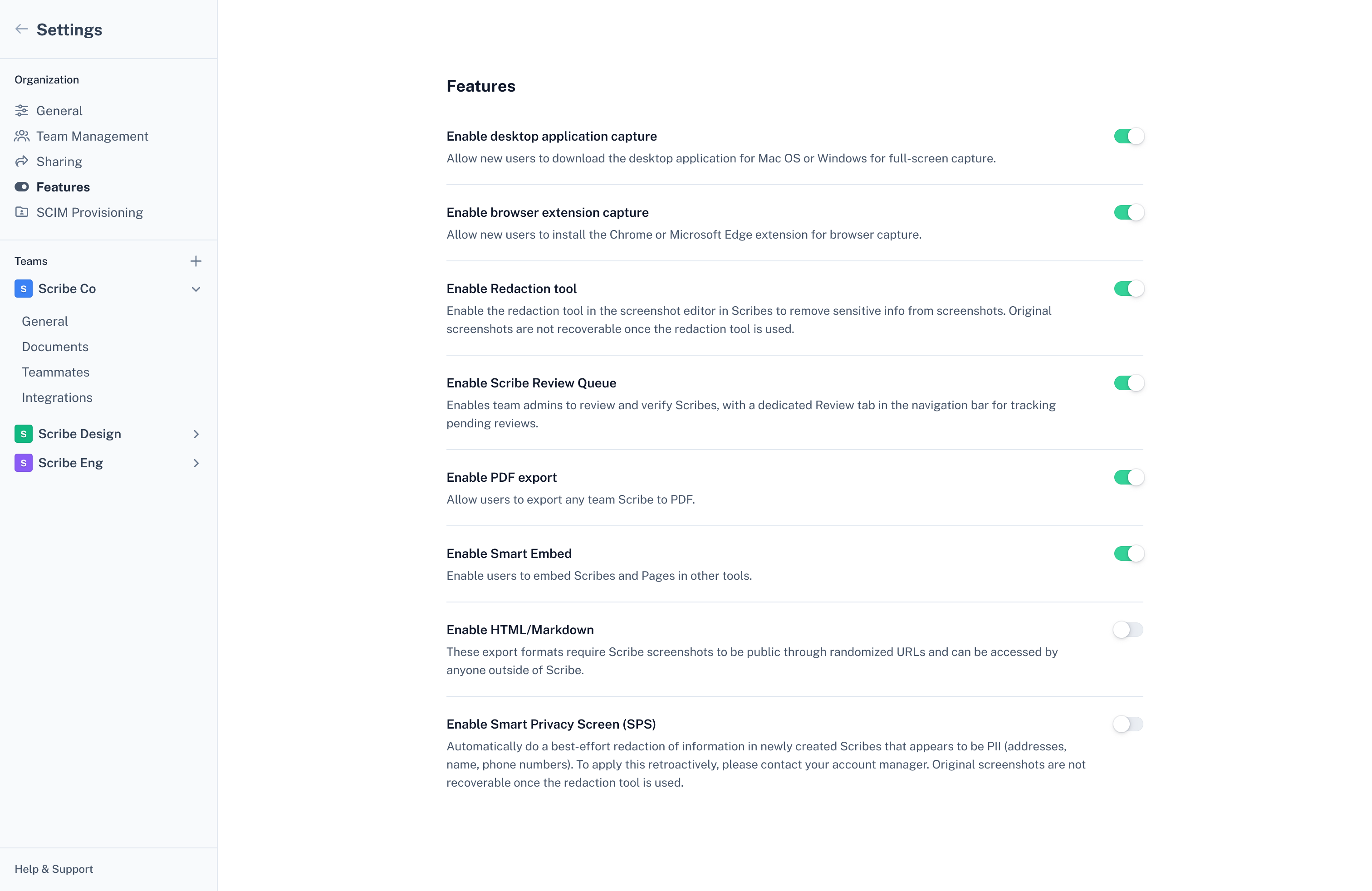
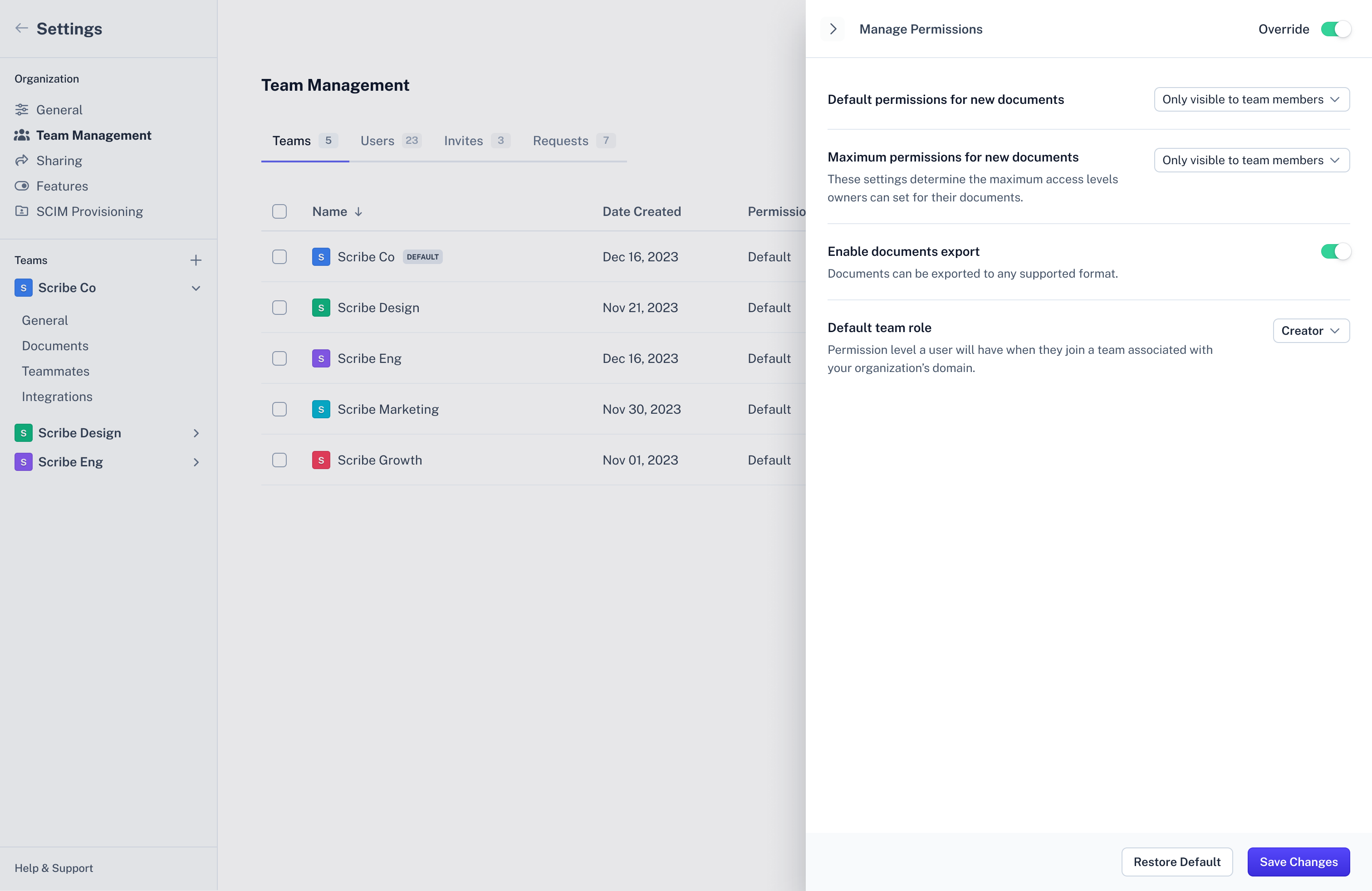
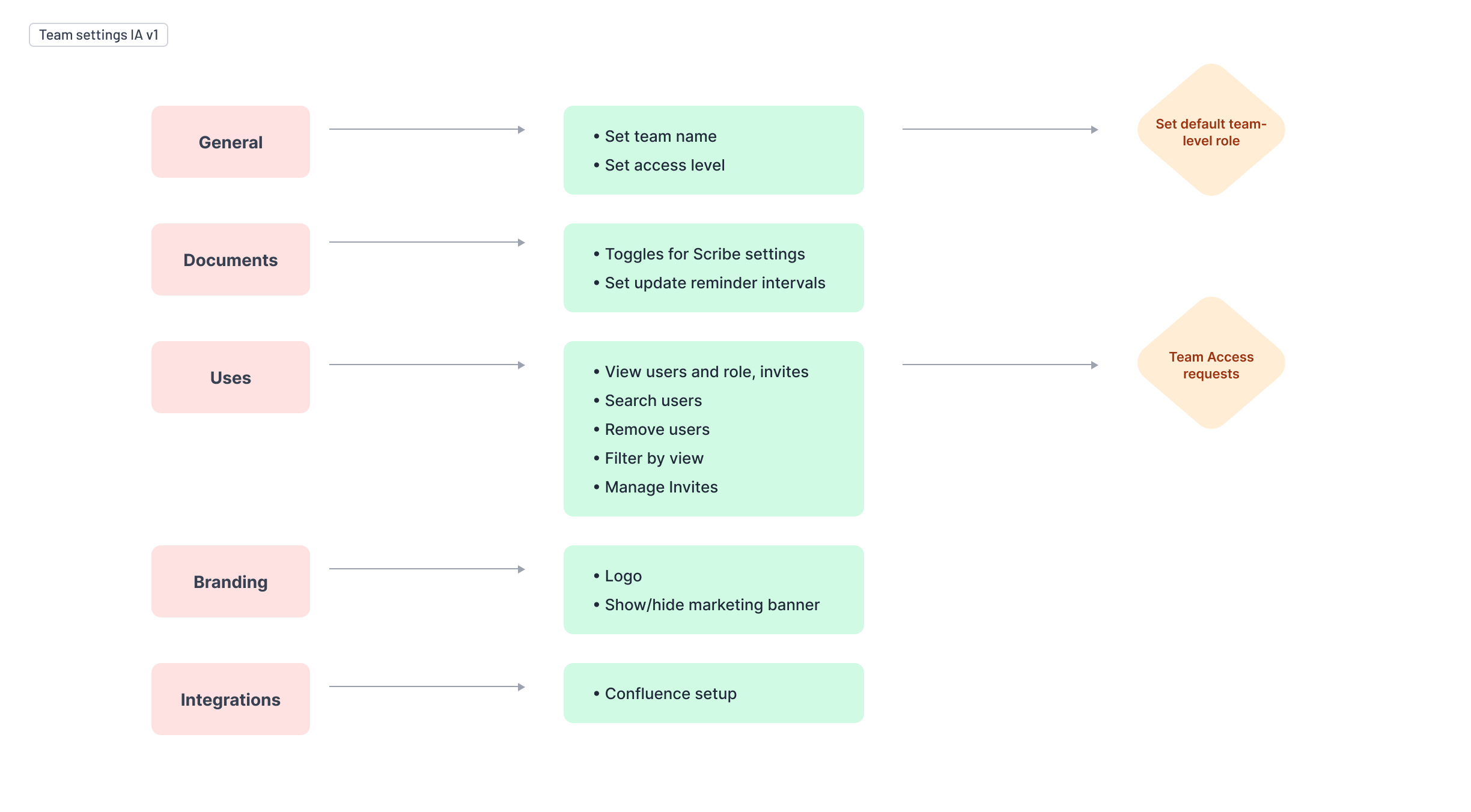
I worked with our PM to restructure how pages were organized and how settings should be split between the enterprise and team levels. Previously, the management of teams and users were in separate settings pages. This took us a few tries to get right with multiple rounds of internal team and user feedback.
The new structure removed the need to bounce between disconnected interfaces and introduced clearer mental models for role-based access giving admins a single cohesive place to manage their organization.
Design decision: Bulk action pattern
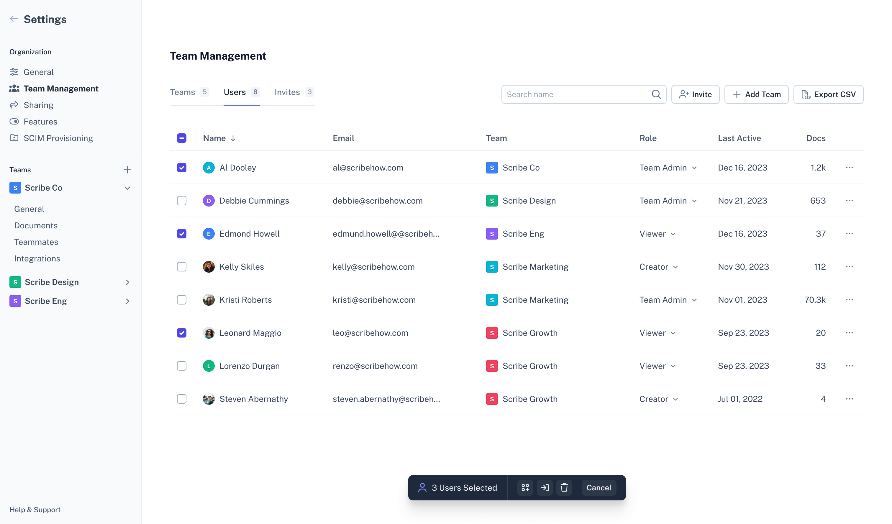
We needed a way to handle bulk actions that felt intuitive. With most inspiration that I looked at showing the controls above the table, I decided to approach it differently and use an action bar that motioned in from the bottom once a user started selecting rows within the table. The motion would draw the eye to further action down the page rather making the user scroll back up to make additional actions.
Additional screens
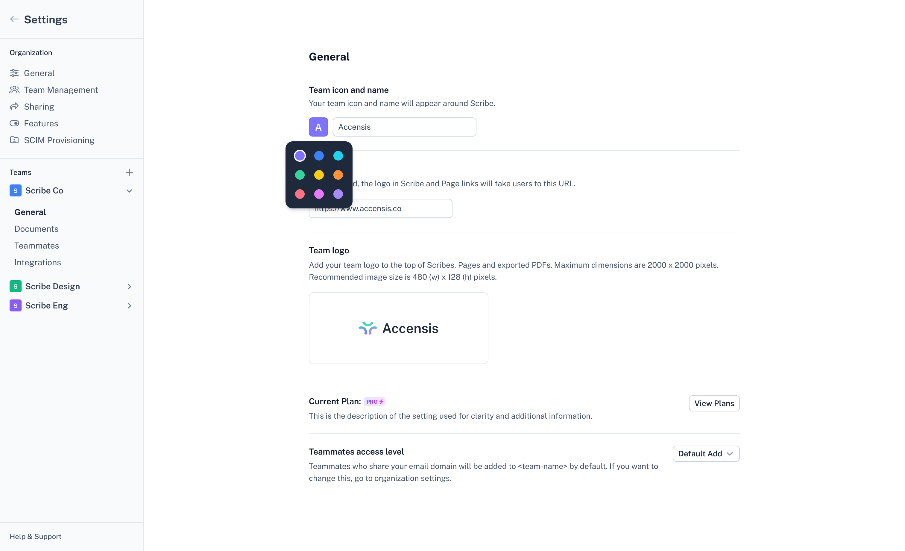
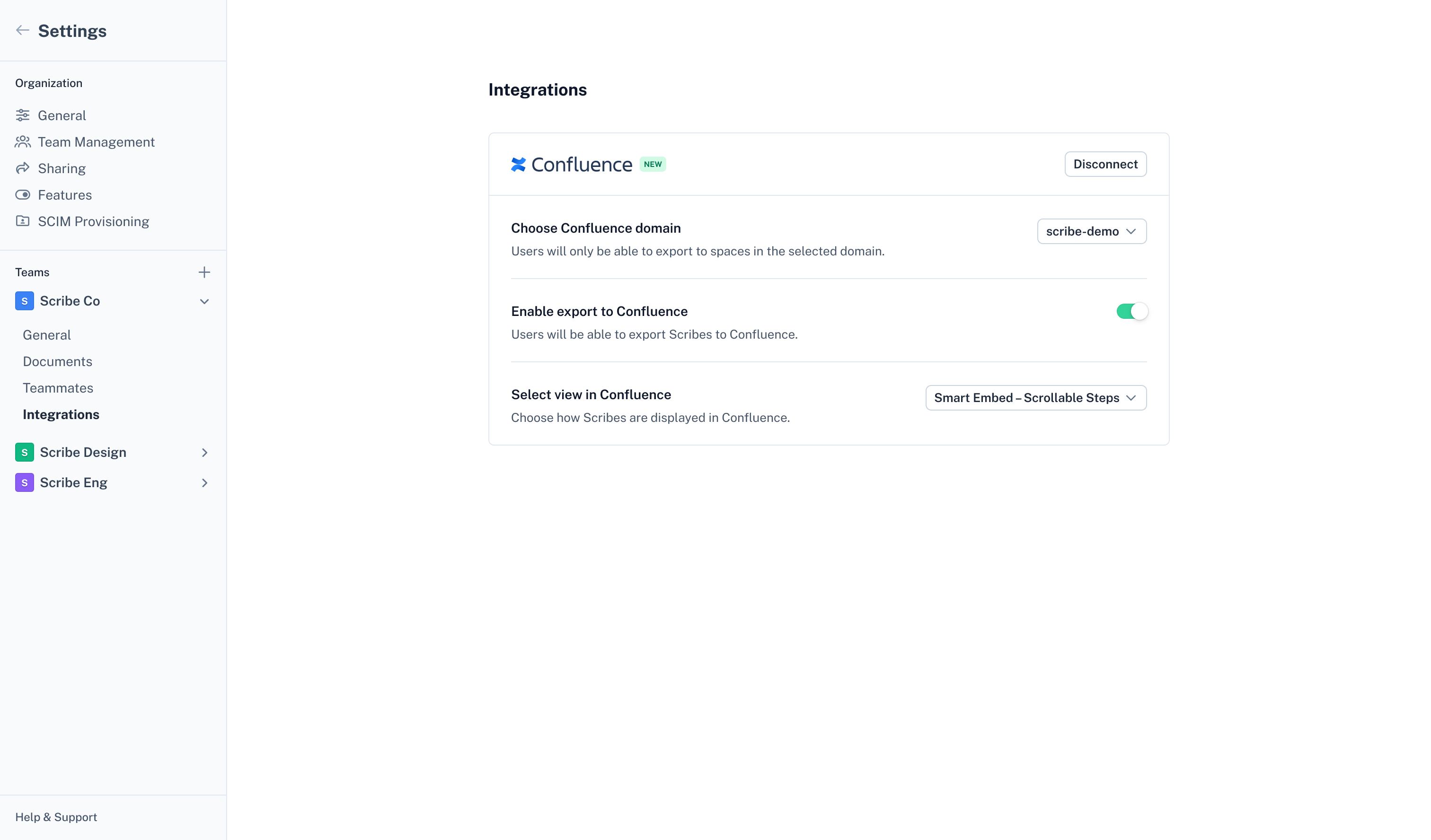
Additional phases happened shortly after to update multiple screens and workflows within the enterprise and team settings. Some of those are shown here.